
Applying the Brand
A big part of who we are as Leathernecks at Western Illinois University is how we look. The colors we use and the way we represent our institution through logos and graphics combine to create a visual identity that helps WIU’s purple stand out.
Naming
Use our full name, Western Illinois University, on first reference and in formal communication materials. The acronym, WIU, and shortened name, Western, are appropriate after the first reference.
Tagline
WIU believes in and embraces fostering student potential. This belief creates a connection and gives a sense of community support for each student. It also promises that we’re dedicated to their experience, education, and future.
WIU Identifiers
Identifiers are wordmarks that connect an identity to our brandmarks. Use of Western Illinois University, Western Illinois, Western, WIU, or Leathernecks need approval by licensing, especially when branded colors, fonts, logos, and other trademarks are involved.
Western Color Palette
Color serves as one of the most recognizable aspects of our identity. Using these colors appropriately helps ensure our communications remain consistent and cohesive.
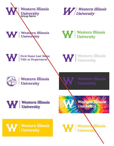
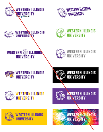
Logos must be reproduced using the WIU purple, white, or with the full-color Rocky face. Accent colors may not be used on logos.
Just like with type or imagery, proper color usage helps create a consistent visual aesthetic in our communications and convey the right visual messages at the right moments.
When using color builds, always use the color values listed here as they have been adjusted for the best reproduction on screen and in print. Using the correct values when working with color ensures consistency.
Primary
Our primary color palette should always be the most prevalent in any piece of collateral or communication.
WIU Purple should be balanced with equal parts white to convey confidence and create areas of visual rest, with gold being added in as an accent element.
| PURPLE | GOLD | WHITE |
|---|---|---|
| PMS 2607 C | PMS 116 C | PMS Spot White |
| CMYK 81/100/0/7 | CMYK 0/21/100/0 | |
| RGB 102/51/153 | RGB 255/204/0 | RGB 255/255/255 |
| Hex #663399 | Hex #FFCC00 | Hex #FFFFFF |
Tonal
Our tonal color palette provides additional opportunities to create dimensional compositions and flexibility when setting typography and graphic elements.
| PMS 2617 C | PMS 130 C | PMS Black C |
| CMYK 79/100/0/40 | CMYK 0/32/100/0 | 63/62/59/94 |
| RGB 59/13/106 | RGB 255/168/0 | RGB 44/44/44 |
| Hex #3B0D6A | Hex #FFA800 | Hex #2C2C2C |
Accent
Our accent color palette was created to supplement the primary and tonal color palettes and should be used occasionally and sparingly. A color from this palette should never become the predominant color in a communication.
| PMS 814 C | PMS Yellow C | PMSCool Gray 1 |
| CMYK 60/70/0/0 | CMYK 0/32/100/0 | 4/2/4/8 |
| RGB 144/84/244 | RGB 255/247/0 | RGB 242/242/242 |
| Hex #9054F4 | Hex #FFF700 | Hex #F2F2F2 |
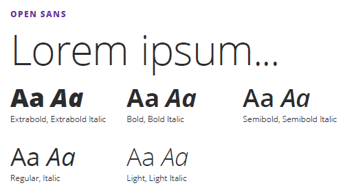
Typography
Inspired by and paired with our voice and tone, our typography serves as a further extension of our brand. When used correctly, it’s a powerful way to convey meaning and mood. Below are guidelines on how to execute from high impact statements to informational copy.
Primary
Open Sans is our primary typeface and should be used as display type for headlines and all body copy.
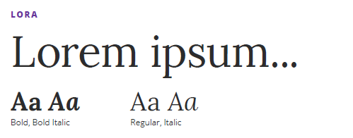
Secondary
Lora is our secondary typeface and our primary serif option. It should be used for accent typography and pull quotes.
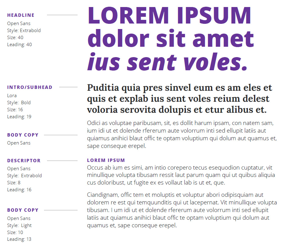
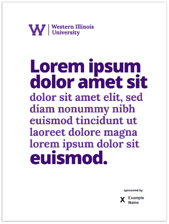
Typography Usage Example
Below is an example application of the type hierarchy and style. Open Sans Extrabold used as a headline reflects our personality traits of spirited, motivated, and confident.
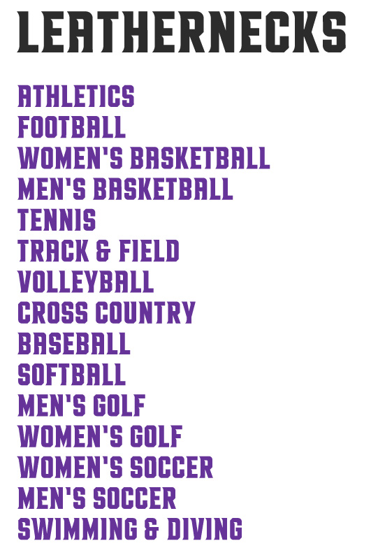
Athletics Typography
Gust is our primary athletics typeface and should be used as display type for all high-impact athletic applications.
Academic, Department, and Division Logos
Academic Logos
The WIU logo is the cornerstone of our visual identity system and must appear on all academic WIU communications.


Group Names
Departments and divisions who would like to have a department logo may utilize the approved design to add the department/ division name. All logos must be approved and created through University Marketing prior to printing/production.


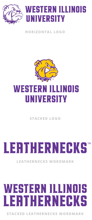
Athletics Logos
Where the academic logo is the cornerstone of our University's visual identity system, the athletic marks do the same for our teams, spirit, and community.
Logo Usage
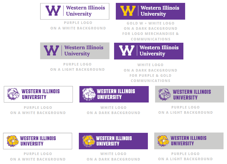
Background Colors
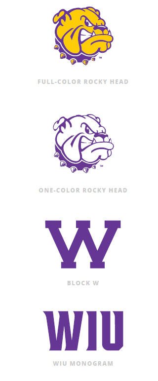
When using our logos, ensure they are positioned on a clean, clear background of good contrast in the approved colors. Logos must be reproduced using the WIU purple, white, or with the full-color Rocky face. Accent colors may not be used on logos.
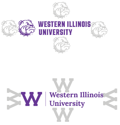
Clearspace
Utilize the height of the W or the height of the Rocky face as clearspace to avoid placement of additional graphic elements too close to the logos. It is important to avoid the appearance of creation of a new logo by placing graphics too close to the logos.
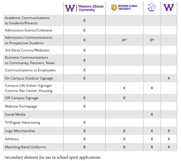
Logo Usage Chart
Below you'll find a chart outling best practices and correct use cases for each of our differenb brand marks, from academics to athletics.
Co-Marketing
When utilizing the WIU logos with additional logos from third parties on WIU communications, ensure that the WIU logo is greater in prominence.
Incorrect Logo Usage
Ensure legibility and maintain integrity of the brand when using the logo artwork files.
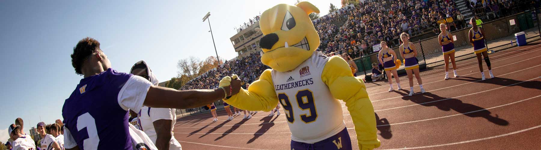
Photography and Videography
WIU photography should help tell our story visually. All photos should feel on-brand. Select photos with people connecting with one another instead of people looking directly into the camera. Focus imagery on positive experiences and the benefits that WIU brings to students. Think engaged vs. staged. Utilize photography with natural lighting in realistic environments. Avoid stock photography where possible.

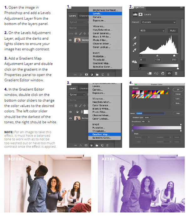
Monotone Imagery
Monotone imagery provides a nice accent to our standard photography library. These images can act just as that, an accent element in a collateral piece, or as a grounding, textural element in a larger composition. The Monotone effect is applied through a few specific steps in Adobe Photoshop, outlined below. A single communication should utilize no more than 10% accent imagery.
Ask us about the brand
We're here to help!
Email: marketing@wiu.edu
Connect with us: